Magnification introduction
The theme of Magnification immediately made me think of microscopic bacteria which I couldn't photograph without an expensive microscope so I thought about the bacteria that the human eye can see. After choosing the topic I found I was also interested in the abstract structure of plant life when zoomed in and the context of the plant is taken out making the fungi for example look unfamiliar and strange. The first three artists I used to inspire these ideas were Heikki Leis, Klari Reis and Damien Hurst.

Heikki Leis
|
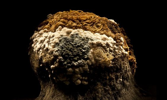
Heikki Leis (b. 1973) was born in Tartu, Estonia. Heikki Leis' Afterlife is a veritable rotting cornucopia of vegetables photographed long past their prime. "I was inspired by some potatoes I had once left out in a pot for too long. They had started to mould and on closer examination the colours and textures looked interesting enough to take some photos," Leis then started experimenting with various fruits and vegetables. He sometimes let them decay for two months, keeping them covered so they wouldn't dry out. When Leis finished, he was truly finished. "I'm tempted to say I ate them, but the truth is I just threw them away," he said.
I love the variety of textures patterns and colours that the mould creates to give the look of an alien object or landscape. Heikki's use of a black background creates a mysterious allure as if the mould we see is just a magnified fraction of a much larger scene. Posed dramatically in chiaroscuro lightning, they emerge from darkness with its ridges of rot, velvet layers of fungi, bubbles of tinted perspiration. |
My response
|
To even begin to replicate the mould in Heikki Leis work I have set up 5 experiments...
1. An Orange that I have left under a bell jar next to a window which I will photograph using a macro lens every 4 or 5 days to track the how the mould changes the way I photograph it. 2. A pot of yoghurt I'm leaving by the radiator to mould that's due date was................ 3. A jar with a circular cut out white bread I've soaked in the mouldy yoghurt liquid I've left by a radiator since mould needs a certain humid and damp environment to grow. 4. A jar of very old cucumber I'm gonna let mould as it likes. 5. A box with a variety of different foods in I'm leaving out and photographing once a day to track the progress of the mould and eventually create an animation. |
|


Klari Reis
|
|
Klari Reis is an American Artist, born in 1977. Klari Reis was diagnosed with Crohn’s Disease recently after her graduation. She became very interested in the results of her blood tests and the different ways it would react to pharmaceuticals when observed via Petri dish. In 2009, she began a new project called ‘Hypochondriac’, which consists of painting Petri dishes with epoxy polymer – a type of plastic – mixed with powders, oils, acrylics and industrial dyes. The result is a smooth, glossy, very bright and colourful surface. This body of work has become very well known, and she continues to work on it even now, and she has a website called http://www.adailydish.com/ where a new petri dish painting is posted every day. The exhibits of this work consist of the hand painted petri dishes mounted on the wall in groups of 150, 60 or 30 individual pieces.
|


My response
In response to Klari Reis's work I filled a petri dish with milk and using a pipit dropped coloured ink and fairy liquid in. The ink would sit atop the milk, but would quickly mix and lose its colour. The fairy liquid completely separated the milk and ink and made it possible to create more intricate patterns similar to Klari Reis's work. I regret not finding a way to take make the backdrop completely white which I think would have made the dishes stand out more.


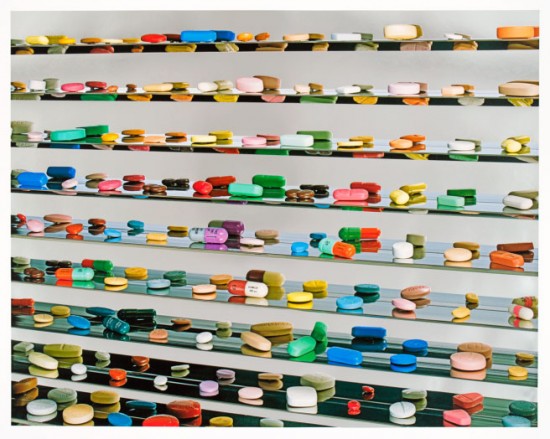
Damien Hirst
|
Damien Hirst born 7 June 1965) is an English artist, entrepreneur, and art collector. Damien Hirst has said ‘art’s about life, and it can’t really be anything else’. In a series of memorable works, often involving provocative materials such as flies, dead animals and formaldehyde, Hirst has made uncompromising statements about the transience of life. In this room installation, he recreates the clinical atmosphere of a pharmacy. Hirst views medicine as a powerful belief system: we are seduced by drugs, believing they will cure all ills and preserve life, though rarely questioning their side-effects.
|
|

|
My response


The composition of the photos were very simple inspired by Damien Hirst which was necessary since I wanted to take all the photos using a macro lens. Playing with depth of field I discovered I could turn the composition into a landscape of pills. I wanted to have more colourful pills however most British pills are white so I tinted all the photographs to be a little green giving them a sickly off-putting aura that is often used in films and other media.
DEV 1 - Man Ray, Dust breeding
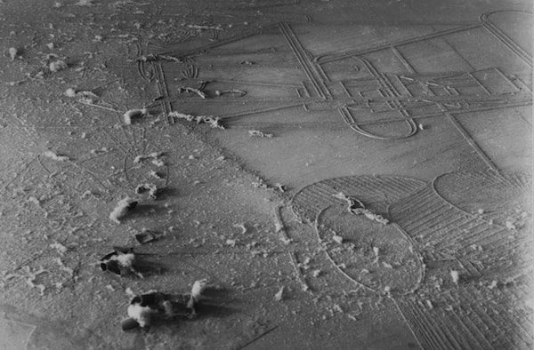
the American photographer and painter Man Ray (1890-1976) was one of Duchamp's collaborators. His photograph Dust Breeding (Duchamp's Large Glass with Dust Motes) from 1920 is a document of The Large Glass after it had collected a year's worth of dust while Duchamp was in New York. The photograph was taken with a two-hour-long exposure that beautifully captures the complex texture and diversity of materials that lay atop the glass surface. Taking inspiration from this photograph I'd like to try different ways of photographing dust to create interesting textures and scenes using its unique and overlooked properties.
Dust Photography
Inspired by Man Rays Dust breeding Photo, I photographed in my houses basement which is Victorian and has never been used by my family since the ceiling is only 3ft high. The basement consisted of mousetraps, Large jars full of dust, insulation, boxes of weird objects from the past residents of the house. It was difficult photographing what I wanted since I couldn't have the flash on my phone at the same time as I used it for the camera. I used the mouse trap to create a diverse depth of field and create guiding lines. The insulation was useful in creating an abstract form similar to the mould so I tried to capture of much of it as possible in some photos.


While editing the best photos I put the exposure and light balance down, desaturated them a little to give them an older look and tinted them green since the photo was already quite green and that was the only colour so I thought it would be interesting if the green bled out across the whole image.
Paris
Hicham Berrada
A cinematic panorama resembling an aquarium immersing the audience in a constantly evolving ecosystem. While the viewer has the impression of being in the middle of coral reef that grow at a quickening pace, the main characters are in fact metals placed in a particular solution that react to each other. Influenced by this exhibit I want to try and demonstrate the growth of mould in my own work and show how it develops.


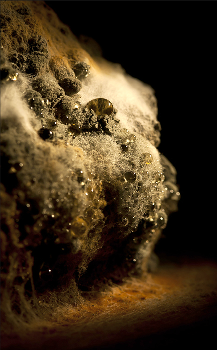
DEV 2 - Orange Mould Photography 3 weeks
I've chosen to focus this topic on photographing mould inspired by Heikki Leis. To create the backdrop I out a black hoody in a box and had previously placed the orange on a black base fir it to grow on. For the still life I added a twig of time around the orange to add a but more volume and more diverse textures to make the photos more interesting and strange. The time also represents the time the orange has spent getting mouldy. I made the decision to leave the brand sticker on the orange which wouldn't mould to create a contrast and so no matter how mouldy the orange got it might still be recognizable thank to that link to its past. I used a black background to make the orange look more alien since you don't know where it is and whether or not its part of bigger scene like Heikki Leis did.


To make it look as is if the orange was sitting in the middle of a darkness I turned down the exposure brightness and light balance and to add to the alieness I tinted the photos a little more green which also made them look even more sickly. I also turned up the contrast of the photos to exaggerate the texture of the mould and make them more cinematic.
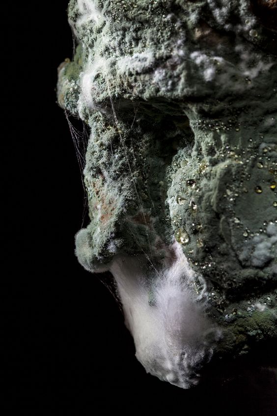
DEV 3 - Final Orange Photography 4 weeks
Before throwing the what was left of the orange out, I choose to photograph it one last time to show its evolution and try out different lighting since the chiaroscuro doesn't give the camera enough light to get super close up. I used two lamps directly over it which helped the camera focus and capture more detail however it also lit the background which draws less attention to the orange and gives the texture more context which makes the orange less alien and weird. The pink tint made the photos look older and worn reflecting the mould of the orange while the green tint helped make the photo look more sickly.


To get rid of the background and make it more canvas like I had to heavily edit the photos taking down the light balance, exposure and brightness and slightly upping the contrast of most the photos so they looked more strange and cinematic. I also played with the saturation and tint to make more interesting colour's almost like the mould from the orange is bleeding into the rest of the photo, I would like to expand on this concept my next developments. I also spiked the highlights to make the mould look more wet and jewel like.

DEV 4 - Tin of Dolma Mould 3 weeks
This experiment had the most diverse mould however it was also the smallest and trickiest to photograph since it was in a tin. I had a hard time getting the camera to focus and the walls of the tin made it difficult to photograph it as a landscape so I composition was everything, creating interesting photos by trying to include the variety of colour's and textures.


I turned up the highlights to exaggerate the droplets so they would look more shiny and jewel like on the beds of velvet mould. I also turned up the saturation and contrast on most of the photographs to give them more depth make them more alien.
DEV 5 - Cucumber and Pizza Mould photography
The cucumber was left in a jar for the longest of all the experiments- about 5 weeks, it had unfortunately become an almost unrecognizable slush and there was nothing interesting about it apart from the disgusting smell. I tried putting it on silver foil to see if it would reflect a green light but it didn't do much. The other subject I photographed was a Sainsbury's margarita pizza which had been left out for 2 or 3 weeks. It was successful in creating an alien landscape because it had more surface area but the mould wasn't as interesting as the Dolma or orange.


I edited the photographs of the pizza in two different ways, either I turned down the saturation and tinted them green to make the photographs look more old and ambiguous almost sci fi esc. Or I upped the saturation and contrast to make it look more similar to a landscape photo. I also cropped the photographs so there was none of the background and tried to keep as much of it in focus in possible while photographing the different depths to further replicate a landscape photograph.
DEV - 6 Orange dies
Dropping the mouldy orange to create a spore cloud. Then dropping a bucket of paint on it. I should have filmed it on a proper camera.
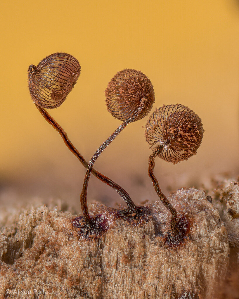
Alison Pollock macro fungi photography
|
California-based photographer Alison pollack finds documents, slime moulds and miniature fungi. Throughout her career she has been finding identifying, photographing and sharing them in order to bring awareness to this fascinating world. ‘these may look big in the photo, but they are really tiny, barely visible to the naked eye, each less than one millimetre tall,’ commented Alison Pollack on a Facebook post. ‘to photograph such tiny fungi with high magnification, I used a 10x microscope lens adapted to my camera, and a technique called focus stacking. each of these three photos is created from hundreds of individual images which were stacked with specialized computer software that combines the in-focus portions of each of the individual images into a composite image that shows everything in focus front to back. it’s a magical photography technique that takes a lot of time and work,'
|
|
DEV 7 - Mushroom/ Fungi photography
Despite not having a super high quality macro lens, I still wanted to photograph fungi since they're closely related to mould and have similarly alien patterns textures. While in the woods looking for mould I came across a lot of a lot of lichen and moss which actually had more interesting textures and I used the focus to blur the background to draw more attention to the lichen.


For the final edits I cropped the entire backdrop out the photo so there was no telling what the fungi was. This unfortunately made the photo loose a lot of definition since I had to crop out all the edges, to make it a little less evident I turned the contrast down to make the texture a little smoother and upped the saturation to better show off the folds of the fungi.
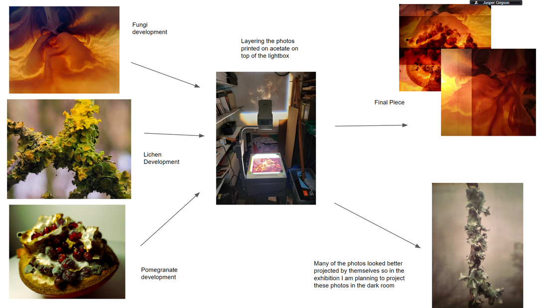
DEV 9 - Lightbox and Projector layered acetate photos.
Using a photo projector and my photos printed onto acetate I made two developments. The projected photos and photos of the acetate layered over the lightbox.
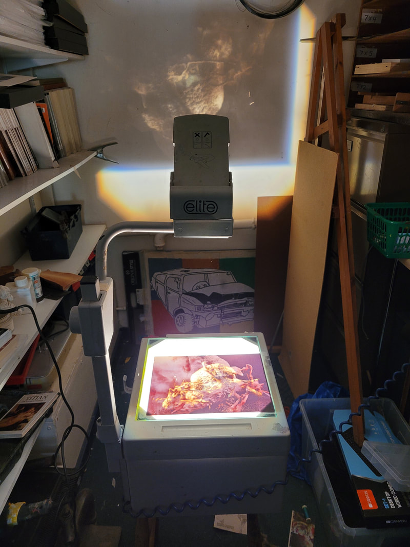
The projections were a lot darker less colourful and less detailed than I anticipated so many of the photos didn't look good projected and I couldn't layer them that much because they got too dark and unclear.


My favourite of these photos were the lichen because I could layer them at angles and their edges added literal guiding lines to their compositions. The lightbox also added a blur around the edges of the photos which gave the picture an aspect of motion like they're coming towards you. I used a photo of the orange with a lot of white and a dark outline which is see opaque on acetate to layer them with the most colourful photos to create a higher contrast. To edit the photos I turned up the contrast and saturation since the acetate prints lacked a lot of colour, I then tinted them green so they would have more resemblance to their original plant form because the saturation was mostly picking up the orange tonnes and the photo blended together a little too much.
DEV 10 - Layering acetate on light box
Since there were about 13 different photos that could all be mixed and layered with each other at different angles and orders finding the ones that worked took ages and then making slight changes to see if I could improve them took even longer so I will have to come back to this later in the project. Unlike the projected versions I could layer 4 of these on the Lightbox before it looked bad and cluttered.


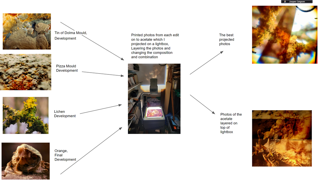
The pictures that looked best together were the ones of same or similar subject for example the photos of pizza I used to layer at random and they blended together very smoother with each extra layer adding more mould and detail. My favourites of the series were again the lichen because they have a good mix of blank space to be filled as well as cluttered alien detail and since they're both photos of the same plant similarly to the pizza I can play with the edges of the acetate to make guiding lines and frames inside frames. I really like how the layered section have more intense colour while the parts with less acetate layers look faded and make a nice congruent background helping the world building of the photo.
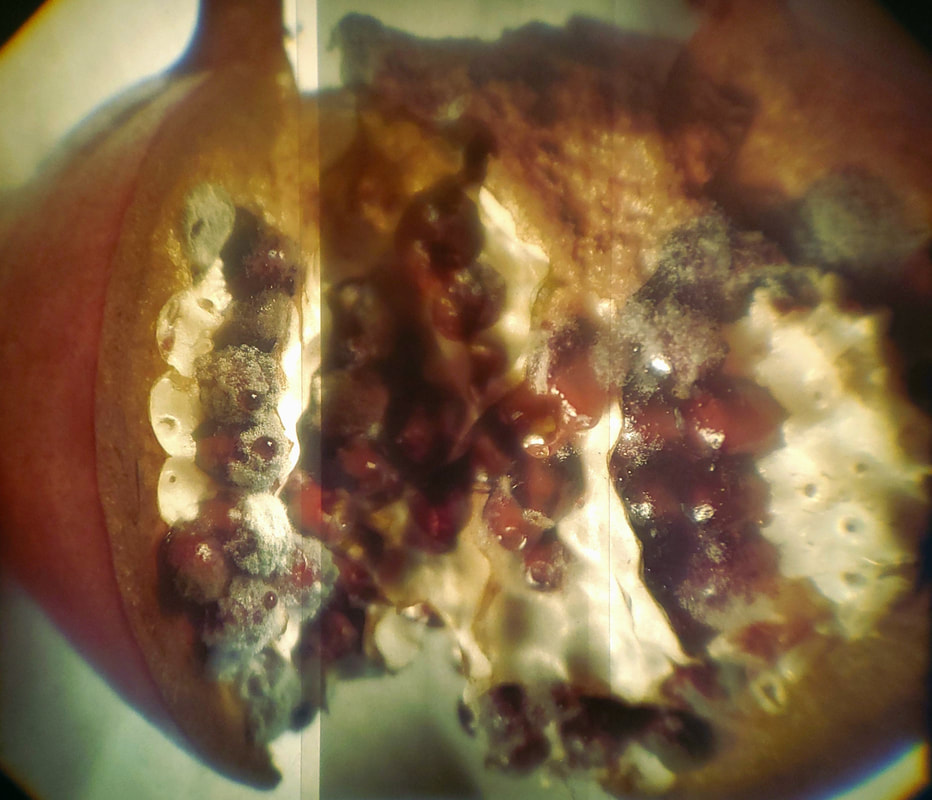
DEV 11 - Mouldy Pomegranate
I took these photos of a mouldy pomegranate because I thought the colours and textures would work really well to layer on acetate. I used a white background knowing that the white translates to negative space on the acetate and I turned up the contrast and saturation of the photos since I knew the acetate print would loose some colour. The pomegranate didn't have as much mould on it as I would've liked despite being left for 3 weeks, I think its because the pomegranate is more dry and has less sugar than other food I have used. I turned up the highlights in all of them to make the backgrounds smoother and whiter and it also made the seeds more eye catching. I tinted the photos a tiny bit green so that the little mould that there is would be more visible because it would contrast and complement the red of the seeds. I aimed to get the camera as close to the pomegranate without it blurring so I could create the illusion that the pomegranate seeds are bigger than they seem.


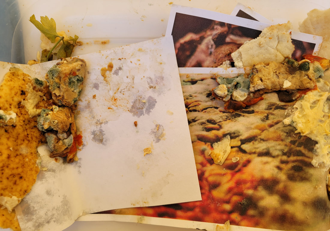
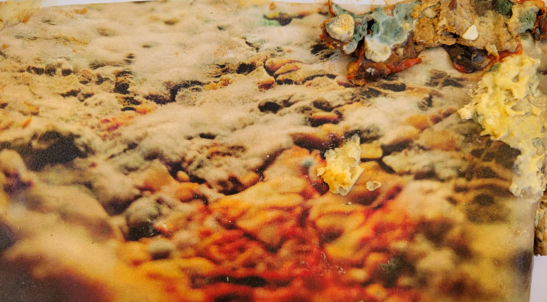
DEV 12 - Mouldy Mould
At first I thought the project had failed and said "I wanted to try growing mould directly on to my best edits but mould just grew on the food on the photos and was in no way attached to the photos".
...I kept the box with the photos still in after scrapping out all the large chunks leaving a a thin layer of slightly mouldy food which I forgot about until a week later I went to wash it out and all the mould had bloomed. I photographed the mouldy photos outside before disposing of them.
...I kept the box with the photos still in after scrapping out all the large chunks leaving a a thin layer of slightly mouldy food which I forgot about until a week later I went to wash it out and all the mould had bloomed. I photographed the mouldy photos outside before disposing of them.
|
|


I thought the most intriguing part of this type of mould was its deep green colour which was the main focus of all the photos I took using the photos I had grown the mould on as canvas. I exaggerated the saturation of all the best edits to emphasize the green mould and contrast it with the reds in the photography. At first I was photographing them flat but I realized That since the mould was 3 dimensional I could also make use of the photos and fold them to create a more diverse spread of photos and balance them with darker sections.
DEV 13 - Darkroom edits
I decided to try layering the acetate in the darkroom to see if it had any interesting effects despite it removing the colour. There is only a focus on texture in these photos and there is hardly any resemblance to their original form.


Final Development
Using a collection of photos I choose from my best edits and the pomegranate photos which I took especially for the final development I layered the acetate on top of a lightbox and photographed them as well as their projections. All the photos I had choose to print on acetate were ones that I thought had the most interesting and alien patterns. Photos with large amounts of nicely composed empty or smooth space like the white background of the pomegranate and the undetailed mushroom photos which despite lacking quality have some of the nicest textures. The projected acetates couldn't be layered since they became too dark as not enough light shone through the pictures so I had to create alternate ways of mixing the projected photos keeping in mind the white and using different compositions laying photos next to each other on the lightbox instead of on top. However the projected photos still looked best by themselves but the photos didn't have the same impact re-photographed, so I plan to black out a room next the exhibition and set up the projector with the best acetate photos for people to play around with their own compositions.


Before starting the exam I knew from my previous try projecting acetate which of my prints would work the best with each other, so I got to spent more time photographing but there was still an abundance of combinations that might work really well that I wanted to try. The most obvious combinations were the mushroom pictures which looked the least familiar of all the best edits however the photo quality held them back. The pomegranate I also knew would create some interesting results but layering the pomegranate looked a bit messy and although more unfamiliar there was to much going on and a lack of composition and guiding lines. The best pomegranate photo I got was one of the simplest splitting the composition using the border of the acetate between a close up and a wide shot of the pomegranate, since therefore you get both the abstract detail without it taking over the whole composition I also thought leaving the wide of the pomegranate in left a clue to hopefully lead to a bit of debate as to what exactly it is. My favorite photo of the whole shoot was a combination of the pomegranate and two of the Mushroom acetates that I originally tried to use as a backdrop but instead I ended up using them to split the pomegranate into bands of light creating a harsh gradient through the Pomegranate, I especially like the veins like wrinkles of the mushroom that seem to be almost protruding out of the pomegranate. The other last two photos I used for the final exhibition prints were just better takes of my favorites photos from my first attempt using the lightbox and projector, however one of them is actually projected since I used a darker room this time as well as a better camera. Unfortunately the lightbox was a tiny bit warped from the heat of the light so I found it very difficult to straighten the lines and edges of the acetate but I couldn't avoid that the stark contrast of colour and light made by the layers helped the composition so much. Cropping the photographs took a while thanks to the warped surface but apart from that I hardly needed to edit the photos at all. I slightly adjusted the saturation and hue of the some of the photos in particular the projected ones since they lost a lot of color but that's it.
If I had to do it all over again I would take better quality photos, edit them to be brighter and remove blur or remove the background before printing them on acetate, As well a trying completely changing the hue of the photos to make them more alien and so they could complement each others colours better.
If I had to do it all over again I would take better quality photos, edit them to be brighter and remove blur or remove the background before printing them on acetate, As well a trying completely changing the hue of the photos to make them more alien and so they could complement each others colours better.


|


|
